
Alternative colors to substitute white in your visual identity.
Today I'll share with you a secret trick we use when branding for global businesses.
It's a simple little trick that you can easily implement in your business, ditch the pure white.
While pure white definitely has its place, it brings that elegant, spacious feel to any design, but you know what? Sometimes we can go beyond the obvious and bring a touch of personality. It's a way to give your design a unique touch that sets it apart from the rest, in an easy and effective way.
However, white remains a very useful and powerful color in design, especially while used as a background color or as part of a broader color palette.
It is often used to convey simplicity, minimalism and cleanliness, and can be combined in many ways with other colors to create interesting visual effects. The context and goals of your brand can decide whether you can use white or it’s better to use alternative colors like the following ones.
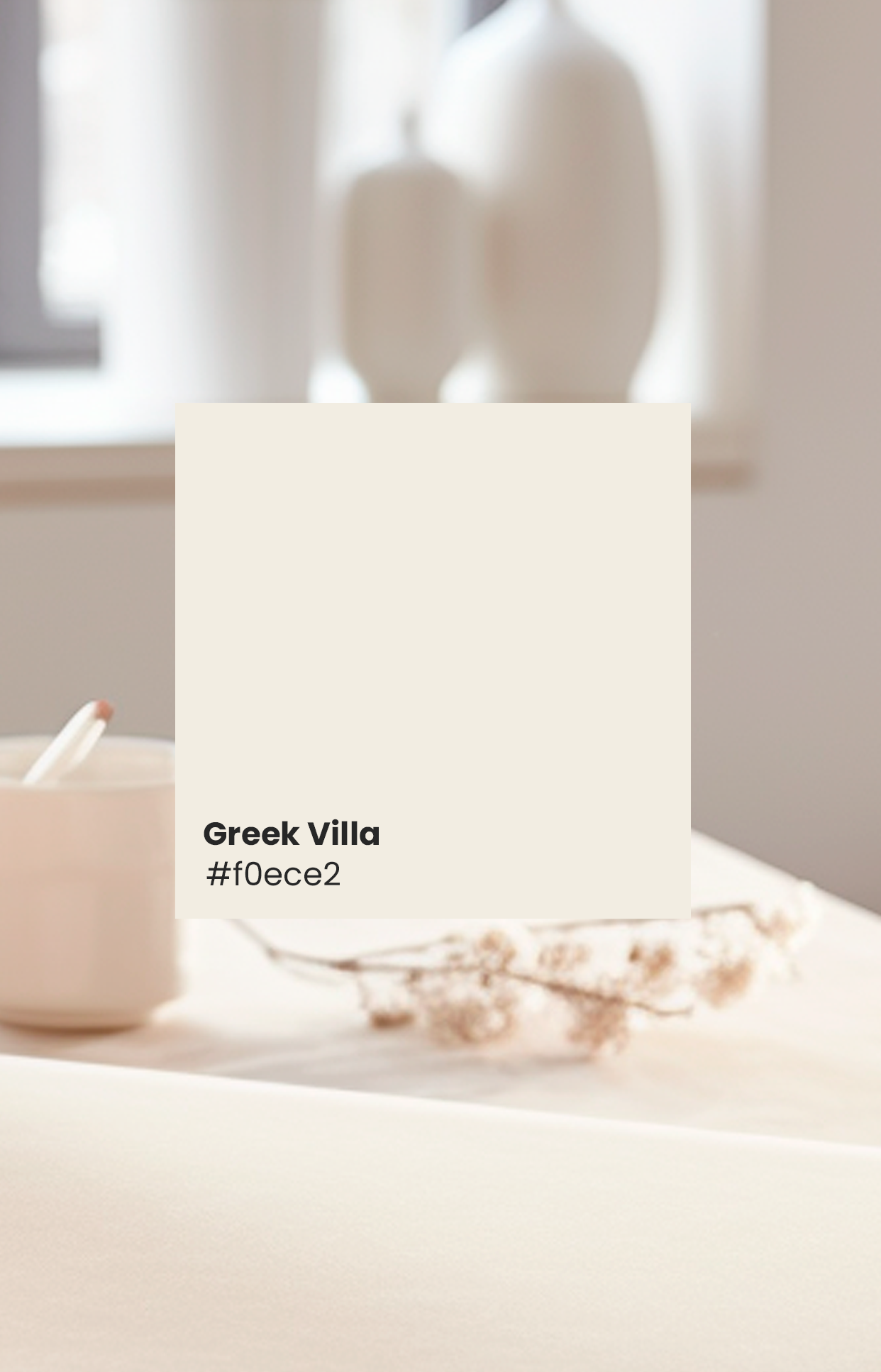
Greek Villa
Light beige is one of the most neutral colors out there, it is not dominant and therefore often used as a backdrop or base for other design elements. It is a popular choice when you want to create a balanced and harmonious brand.
It is often associated with elegance and sophistication. It is a classic and timeless color that can be used to create brands for clothing stores, furniture and interior design.
Like other soft colors, it can convey a feeling of calmness and serenity.
The neutrality of light beige makes it a versatile design choice. It pairs well with a variety of other colors, allowing it to be used as a base for more complex color schemes
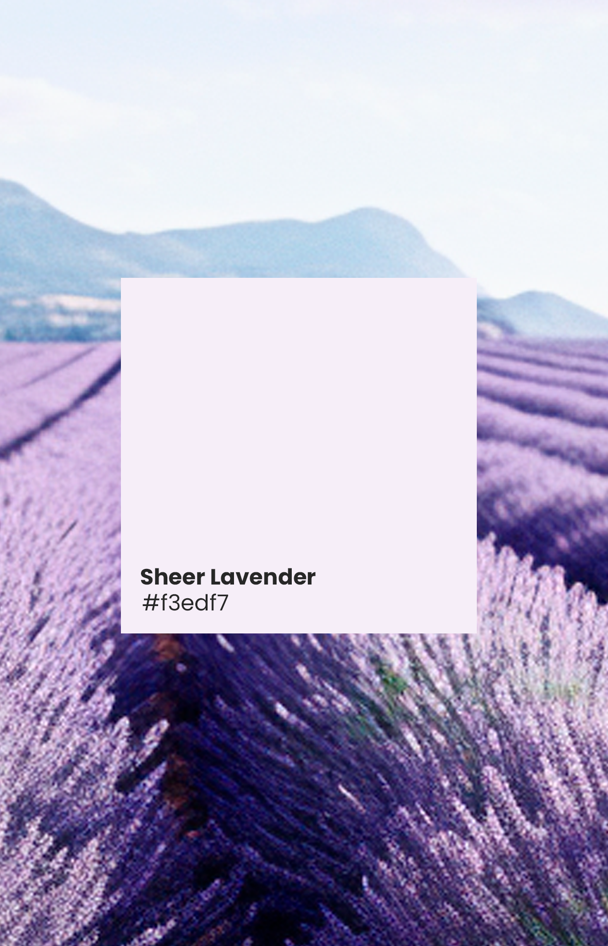
Sheer Lavender
It is a color that is generally associated with light purple and violet tones. Lavender is a color that evokes feelings of calmness, serenity and femininity. It can vary in different saturations, ranging from softer and paler tones, such as "Sheer Lavender", to deeper and richer tones.
Lavender is often used in interior decoration, graphic design, and fashion, especially in contexts related to spring and summer, due to its light and airy nature. This color is also commonly associated with relaxing scents and fragrances and is used in personal care products such as soaps, candles, and aromatherapy products.
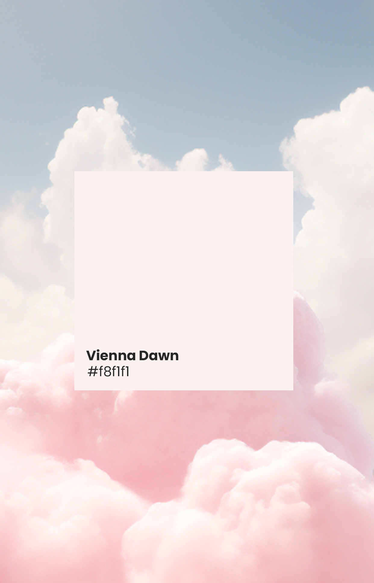
Vienna Dawn
Due to its softness, light pink often conveys a feeling of innocence, purity and sweetness. This color can be used to evoke feelings of tenderness and kindness.
Light pink is often associated with love and affection. It is a color that symbolizes care and affection.
In its softest form, light pink can have a calming and relaxing effect on people. It is a popular choice for companies that want a brand to convey romanticism, delicacy and care for the company in a logo.
Light pink can convey a feeling of youth and energy, especially when combined with other vibrant colors. It is a color frequently used in products aimed at children.

Mint Grasshopper
The soft mint color is a pale green shade with soft blue undertones. It is often described as a refreshing and calming color.
It evokes a feeling of freshness and vitality. It is a color reminiscent of nature and renewal, which makes it a popular choice in graphic design and branding projects where you want to create a refreshing atmosphere.
Like many shades of green, soft mint is considered a calming color. It can be used in spa, yoga, meditation, to create a feeling of tranquility.
It's a broad color that is useful in products, fashion and design aimed at younger audiences as well, Soft mint can be used to create a sense of subtle elegance. It is a popular choice in more formal companies.

Morning Mist
Just like tranquility, light blue evokes a feeling of serenity. This color is used to create peaceful and stress-free environments.
Light blue is reminiscent of elements of nature, such as the sky and water, which makes it a refreshing color. It is often associated with a feeling of freshness and vitality.
Often associated with trust and reliability, and light blue is no exception. It is a common choice in logos and corporate identities to convey an image of stability and professionalism.
It is considered a pure and clean color, which makes it a popular choice in personal care products and hygiene-related products.
Light blue is often used to create a sense of clarity and communication. In graphic design and presentations, it can be used to highlight important information.
Enjoy your creativity!
Knowing these delicate alternative colors to white allows us to enjoy personality in our designs, creating a visual identity that differentiates your brand from others. By choosing the right color palette, you can find the perfect balance between professionalism and exclusivity, delivering an exceptional and distinctive design that speaks to your audience and keeps your brand memorable!